An ode to imperfections

In a digital world, “to err is human” is starting to mean a lot more.
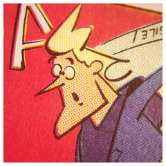
I know that my 3rd grade teacher would disagree, but I think sloppiness can often trump perfection. Just take registration in older comics.
Putting together comics in the past required skills that few possess today. Before digital techniques, comic were printed using a complicated process to get pages in color. Each image was printed on a film, and color film had to be hand cut to fill the spaces. Generally, people were more skilled in the past, but we all know what it’s like at work. Although we want to be at the top of our game, sometimes you just do a so-so job.
And that’s the best part of these 1960s comics: the little imperfections. The plates and films are often slightly off-register, with colors overlapping when they shouldn’t. The result is a softer, home-ier image, albeit one that is a little sloppy.
I’m not saying that we shouldn’t strive to do the best we can with everything we tackle, but when I look back at those comics from the 1960s with their imperfections, they seem more human. Today, with the precision provided by digital printing, people don’t have as much to do with the quality of the final project, and you can be sure that each page will look exactly as drawn and colored. But maybe there isn’t the same life to the final product, not as much soul put into each image with its tiny, human errors.